The Anatomy of a Feel-Good Movie (Is Joy Just Bright Colors?)
What does "happiness" look like in a dataset? Is it just pumping up the saturation slider? I took three "joy" classics—The Wizard of Oz, Forrest Gump, and La La Land—and broke them down to see if they share a chemical formula. The data suggests they don't. In fact, they are barely the same genre.
The Personality Test (Radar)
I mapped the "shape" of each movie across 5 key metrics.
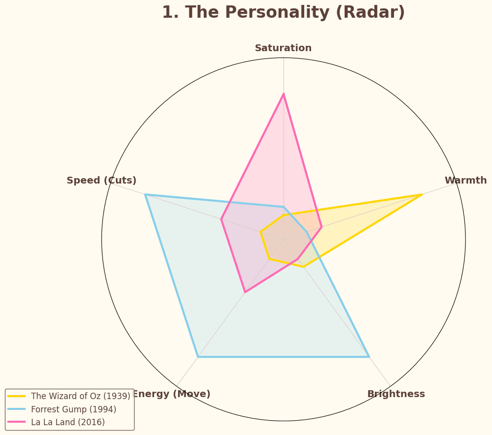
The results destroy the idea that Forrest Gump is a "slow" movie.
-
Forrest Gump (Blue): The Sprinter. Look at that massive spike in Speed (Cuts) and Energy (Move). It isn't a "quiet" film; it’s frantic. It creates joy through momentum and pacing, not visual style.
-
La La Land (Pink): The Painter. This is the only film that actually relies on color. It dominates the Saturation axis, sacrificing realism for pure, artificial vibrance.
-
The Wizard of Oz (Gold): The Hearth. It doesn't care about cutting speed or movement. It maxes out on Warmth and Brightness. It wants you to feel safe, not excited.
The Pulse (Kinetic Energy)
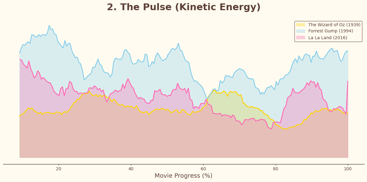
Does "Joy" have a rhythm? I tracked the pixel movement (Optical Flow) over time.
-
Forrest Gump (Blue): Consistent chaos. The blue wave stays high throughout the film. The camera is always floating, running, or following. It feels "alive" because it never sits still.
-
The Wizard of Oz (Yellow): Controlled staginess. Notice how the yellow line dips and holds steady. It feels like a stage play—the camera observes the action rather than participating in it.
The Atmosphere (Light Distribution)
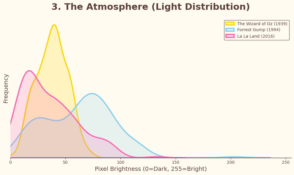
Finally, I graphed the luminance (brightness) density to see the "air" of the film.
-
The Wizard of Oz (Yellow): The "Studio" Look. The curve is incredibly sharp and peaks early in the shadows (around value 40). This is the high-contrast look of early film—deep blacks and controlled spotlights.
-
Forrest Gump (Blue): The "Real" Look. A flatter, wider curve that stretches into the mid-tones. It mimics the messy, uneven lighting of the real world.
-
La La Land (Pink): The "Mood" Look. It has a distinct "double hump"—embracing the dark jazz clubs as much as the bright LA sky.
Visual Proof (The Barcodes)
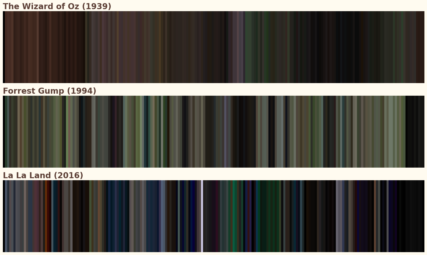
The barcodes confirm the data: "Joy" comes in three distinct flavors.
-
Sepia to Technicolor: Oz (Top) shows the most famous transition in history—from the brown dust of Kansas to the hard-coded rainbow of Oz.
-
Earthy Realism: Gump (Middle) is a wash of organic greens and sky blues. No neon, no tricks.
-
Neon Dreams: La La Land (Bottom) is unmistakably modern—deep blacks punctuated by vertical bands of purple and blue stage lights.
The Verdict
We think of "Feel-Good" movies as a single category, but the data separates them into three distinct strategies:
-
The Hug (Oz): Warmth and high contrast.
-
The Trip (Gump): High speed and constant motion.
-
The Dream (La La Land): Deep saturation and artificial color.
Choose your pill.
Comments0
Log in to join the conversation.
